
Color is not just decoration; it is one of the fastest ways to change how a home feels, functions, and even how people behave inside it. In a single weekend, a new wall color can make a small Plano kitchen feel open and airy, or turn an unused spare room into the most inviting spot in the house. As homeowners spend more time at home working, relaxing, and entertaining, the impact of color in home design has become impossible to ignore. It affects mood, perceived space, resale value, and how well your home supports your daily routines.
In North Texas, where intense sunlight and dramatic seasonal temperature swings are part of everyday life, color choices take on an extra layer of importance. The same shade that looks soft and neutral in a showroom can appear harsh or washed out in a sun-drenched Plano living room. That is why thoughtful color planning, combined with expert remodeling guidance from a company like Nielsen’s Remodeling & Construction Co., can transform a simple paint job into a complete experience upgrade. When color is planned as carefully as layout and materials, the result is a home that not only looks beautiful, but feels right at every time of day.
Color also matters now because our homes are doing more jobs than ever. One room might need to serve as an office, classroom, gym, and movie night hub. The right color strategy can quietly support all those roles by signaling when it is time to focus, unwind, or gather. Rather than chasing trends, Plano homeowners are realizing that color can be tailored to their lifestyle, climate, and architecture in a way that is both personal and practical. That shift—from decorating with color to designing with color—is where the true impact begins.
How Color Shapes Mood
Psychologists and designers have long known that color can influence how we feel, but many homeowners underestimate just how powerful that impact can be. Warm colors such as soft terracotta, muted gold, and clay-inspired pinks can make a large, echoing space feel intimate and welcoming. Cool colors, including blue-grays and gentle greens, tend to calm the mind and reduce visual noise. In a busy Plano household, that can mean the difference between walking into a room and feeling stressed, or stepping in and instantly relaxing after a long day.
Consider the primary bedroom. If it is painted in a bright, high-energy hue like saturated red or neon yellow, it might look exciting during the day but feel overwhelming at night when you are trying to sleep. Shifting the palette toward deeper, quieter tones—such as stormy blue, eucalyptus green, or a warm mushroom neutral—can support better rest by creating a cocoon-like feeling. Nielsen’s Remodeling & Construction Co. often recommends testing these shades on large sample boards in the actual bedroom, so homeowners can see how the color behaves with morning and evening light before committing.
The same logic applies to spaces where focus and productivity are critical. For a home office in Plano, cooler mid-tone blues and greens are often ideal because they help reduce anxiety and encourage sustained concentration. Paired with crisp white trim and natural wood, these colors feel professional without feeling sterile. In contrast, a playroom or game room might benefit from more vibrant accents—such as a single bright stripe, colorful built-ins, or a bold ceiling—to spark creativity and energy without overwhelming the entire space.
Color And Perceived Space
Color can dramatically alter how big or small a room feels, even when no walls are moved. Light colors tend to reflect more light, making spaces feel larger, airier, and more open. This is especially valuable in many Plano homes where interior rooms may not have expansive windows. Painting walls, ceilings, and trim in similar light tones can blur boundaries, creating the impression of a seamless, more expansive space. Nielsen’s Remodeling & Construction Co. often uses this strategy in narrow hallways or compact bathrooms to keep them from feeling cramped.
Darker colors, on the other hand, can be incredibly effective when used intentionally. A deep charcoal or rich navy in a small powder room might sound risky, but it can actually produce a luxurious, enveloping effect. The key is balance: pairing dark walls with good lighting, reflective finishes, and lighter floors or countertops. In an open-concept Plano living area, a deeper accent color on one wall can visually anchor the room, creating a sense of structure without erecting physical barriers.
Ceilings are another powerful but often overlooked canvas. Painting a ceiling a slightly darker shade than the walls can make a tall, cavernous room feel more grounded and comfortable. Conversely, in a low-ceilinged room, keeping the ceiling a bright, light tone can create the illusion of extra height. When Nielsen’s Remodeling & Construction Co. designs whole-home remodels, they frequently treat ceilings as a crucial part of the color plan, rather than defaulting to standard white. This integrated approach ensures that every surface contributes to the perception of space.
Even transitions between colors can change how your home feels. If a kitchen is painted in a crisp white and the adjoining dining room jumps to a very dark hue, the shift can feel abrupt and chop up the floor plan visually. Using a cohesive palette of related tones—lighter in some rooms, deeper in others—allows sightlines to flow smoothly, making the entire home read as more spacious and harmonious.
Light, Climate, And Local Context
Color does not exist in a vacuum; it is shaped by light, surroundings, and even regional climate. In Plano, Texas, the strong Texas sun can intensify certain colors, making them appear brighter or more yellow than expected. North-facing rooms may lean cooler and darker, while south-facing rooms can flood with warm light. This means that the same paint color can look entirely different from one side of your home to the other. Thoughtful design takes these variations into account to avoid surprises once the paint dries.
For sun-soaked rooms, cool neutrals with a hint of gray or blue can help balance the warmth, preventing spaces from feeling overly hot or glaring. In shaded or north-facing rooms, slightly warmer tones—think greige with a beige lean, creamy whites, or soft clay—can keep the room from feeling flat or chilly. Nielsen’s Remodeling & Construction Co. often schedules color consultations at multiple times of day so Plano homeowners can see how natural light shifts the mood of each room.
Exterior surroundings also influence interior color. If your home looks out onto bright green lawns, mature trees, or the warm stone commonly seen in North Texas neighborhoods, those hues will reflect into your rooms. A beige that seems calm in the store may pick up green undertones next to a yard full of live oaks. Conversely, a home with more neutral surroundings may allow bolder interior colors to shine without clashing. Recognizing these relationships helps avoid mismatched palettes that feel “off” without an obvious explanation.
Climate and lifestyle go hand in hand. In hotter regions like Plano, homeowners often gravitate toward fresher, lighter palettes that feel cooling, especially in kitchens and living rooms where families gather. However, that does not mean every room must be pale. A media room, for instance, can benefit from deeper colors that reduce glare on screens and enhance the theater-like atmosphere. A nuanced palette that respects both Texas sunlight and the way your family lives will always outperform a one-color-fits-all approach.
Color In Kitchens And Bathrooms
Kitchens and bathrooms are some of the most color-sensitive rooms in a home because they combine hard finishes, fixtures, and strong lighting. The wrong color can make countertops look dated, tiles appear dingy, or cabinets seem disconnected from the rest of the house. In Plano, where many homes blend open-concept layouts with prominent kitchen islands, the kitchen color scheme often sets the tone for the entire main level. That is why Nielsen’s Remodeling & Construction Co. treats cabinetry, wall paint, backsplash tile, and flooring as a cohesive color story rather than separate decisions.
White and off-white kitchens remain popular because they feel clean and timeless, but subtle variations in undertone matter enormously. A cool, blue-leaning white can clash with warm wood floors, while a creamier white may look yellow under certain LED lights. Introducing color through the island, lower cabinets, or backsplash is a smart way to bring personality into the space without overwhelming it. Deep green cabinets paired with brushed brass hardware, for example, can create a modern yet classic look that works beautifully with many Plano homes’ existing architectural styles.
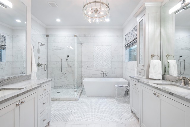
Bathrooms offer a chance to be bolder, especially in smaller spaces like powder rooms. A dramatic jewel-tone wall color, patterned tile, or dark vanity can turn a purely functional room into a memorable design feature. However, for primary bathrooms where relaxation is the goal, softer spa-inspired palettes often work best. Pale blues, misty greens, and warm grays can make a bathroom feel like a retreat, especially when paired with natural stone and wood accents. The right color can also flatter skin tones around mirrors, which is important for everyday routines.
Lighting is particularly critical in these rooms because of mirrors, reflective surfaces, and the need for task visibility. Plano homeowners often upgrade to layered lighting—recessed, sconces, under-cabinet—to complement their color choices. Nielsen’s Remodeling & Construction Co. pays close attention to how artificial light temperature (warm vs. cool) interacts with paint and tile colors so that the finished space feels cohesive day and night, not just in perfect daylight.
Color, Style, And Resale Value
Personal preference should always guide your color choices, but it is also wise to consider how color affects resale value. Neutral, well-coordinated palettes tend to appeal to the widest range of buyers, especially in competitive markets like Plano. That does not mean your home must be all white or gray. Instead, it means using more permanent elements—such as flooring, built-ins, and large surfaces—in versatile hues, while reserving more adventurous colors for paint, textiles, and decor that are easier to change.
For homeowners who love bold color, strategic placement is key. A deep blue dining room, a richly colored front door, or a moody home office can become memorable selling points if they are executed thoughtfully and harmonize with the rest of the house. When Nielsen’s Remodeling & Construction Co. updates a home with resale in mind, they often create a cohesive base palette that flows from room to room, then layer in color through accent walls, tile details, or cabinetry in targeted areas.
Architectural style also plays a role in color decisions. A mid-century ranch in Plano might embrace earthy tones, warm woods, and saturated accent colors that highlight its era, while a more Traditional home design may look best with softer, classic palettes and subtle contrasts. Matching your color strategy to your home’s architecture creates a sense of authenticity that buyers and guests instinctively appreciate. It also helps avoid the jarring effect of ultra-trendy colors that clash with the bones of the house.
Ultimately, the most valuable color schemes are those that feel current but not fleeting. By focusing on timeless undertones, balanced contrasts, and a logical flow from space to space, you can enjoy your home now and still appeal to future buyers. With guidance from professionals familiar with the Plano market, like Nielsen’s Remodeling & Construction Co., you can strike that balance with confidence.
Working With A Color-Conscious Remodeler
Many homeowners think of color as the final step—something to pick after the cabinets, flooring, and fixtures are installed. In reality, integrating color decisions early in the remodeling process leads to better results and fewer compromises. When a remodeler like Nielsen’s Remodeling & Construction Co. in Plano weaves color into the initial design phase, they can coordinate paint, tile, countertops, and hardware so that everything feels intentional rather than pieced together.
This collaborative approach often begins with understanding how you want each room to feel, not just how you want it to look. Do you need a kitchen that energizes you in the morning? A living room that soothes the whole family after work? A bathroom that feels like a spa? From there, the design team can build a palette that supports those emotional goals while respecting practical needs like durability, maintenance, and lighting conditions.
Mockups, samples, and real-world testing are essential tools. Instead of choosing colors from tiny swatches, a thoughtful remodeler will encourage you to view larger samples on-site, compare options against existing finishes, and look at them at different times of day. In Plano’s bright sun, this kind of testing can reveal undertones and shifts that would be invisible in a showroom. It also gives you confidence that the final result will match your expectations.
By treating color as a core design element rather than an afterthought, you unlock its full power to transform your home. The right partner can help you navigate countless options, avoid costly mistakes, and create a home where every room feels purposeful, beautiful, and distinctly yours.
Frequently Asked Questions
How do I choose a color palette that works for my whole home? Start by identifying 3–5 core colors that will repeat throughout your home: usually one main neutral, one secondary neutral, and a couple of accent tones. Look at your fixed elements—floors, countertops, stone, and large furniture—to see what undertones they contain (warm, cool, gray, beige). Choose paint colors that complement those undertones so everything feels harmonious. From there, vary depth and saturation from room to room rather than changing hue completely. Nielsen’s Remodeling & Construction Co. often helps Plano homeowners build a “palette map” that assigns specific colors to each space while maintaining a cohesive flow.
What colors are best for small rooms in Plano homes? For small rooms, lighter colors are often the safest starting point because they reflect more light and make the space feel larger. Soft whites, light greiges, and pale blues or greens can all work well. However, a small room can also become a standout feature with a darker, cocooning color—especially for powder rooms, reading nooks, or media spaces. The key is to pair dark walls with adequate lighting and some lighter elements (trim, ceilings, or furnishings) to avoid a cave-like feel. Testing samples in the actual room is especially important in smaller spaces where color intensity is magnified.
How does Plano’s sunlight affect interior paint colors? The strong Texas sun can make colors appear brighter, warmer, and sometimes more yellow than they do on a swatch. South- and west-facing rooms receive warm, intense light that can wash out pale colors or exaggerate warm undertones. North-facing rooms, by contrast, may look cooler and darker, causing some colors to appear dull. That is why it is crucial to view paint samples on each wall at different times of day before deciding. A remodeler experienced with Plano homes, like Nielsen’s Remodeling & Construction Co., can suggest specific shades known to perform well in local light conditions.
Are bold colors a bad idea if I plan to sell my home? Bold colors are not automatically a problem for resale, but they should be used strategically. Large, permanent surfaces in very strong colors can limit buyer appeal because they are harder to change. However, a few well-chosen bold rooms—such as a dramatic dining room or a stylish office—can actually make your home more memorable. If you plan to sell within a few years, consider using bold hues on walls rather than cabinetry or tile, so they are easier to repaint if needed. Keeping a neutral, cohesive base throughout the main areas while adding personality in select spaces is often the best compromise.
How can I test colors before committing to a full remodel? Begin with temporary, low-risk changes: paint a single accent wall, use large poster boards painted with sample colors, or introduce potential palette shades through pillows, rugs, and artwork. Observe how these colors look at different times of day and how they interact with your existing finishes. If you are planning a remodel with Nielsen’s Remodeling & Construction Co., ask for material boards and digital renderings that combine paint, tile, and cabinetry colors. This layered preview helps you see the big picture and make confident decisions before any major work begins.